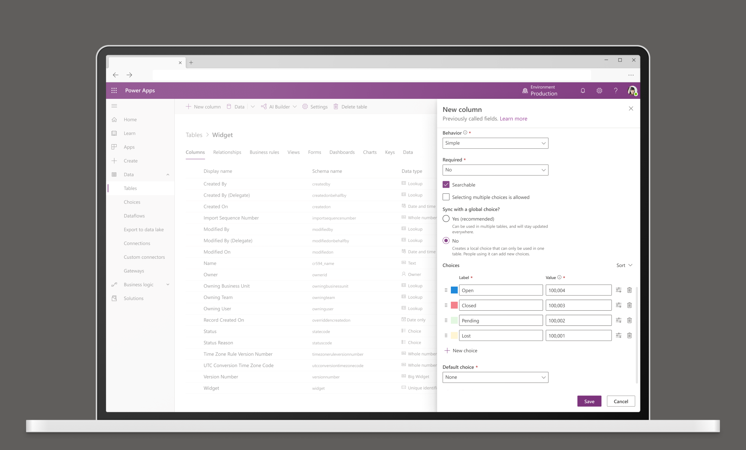
Creating a Choice Data Type
Choices are a core data type used by a lot of apps. They allow users to pick options from a set of choices. As a robust data type, they can also get fairly complicated. This experience allows users to manage creation and editing in one place, and creates a solution that simplifies things for new and pro users alike.
My Role
UX design, interaction design, wireframes, prototyping, usability testing
Timeline
6 weeks

Problem
Full creation and editing abilities were split between a legacy and an updated product space without full parity. This was especially challenging for prodev users who had to jump between multiple locations to fully edit their choice data types.
Newer users needed a way to edit in a way that scaled to full customization without being completely overwhelmed by advanced options they may not need.
As a business need, there was a push to deprecate the legacy space to reduce overhead and management for a part of the product with lower traffic.
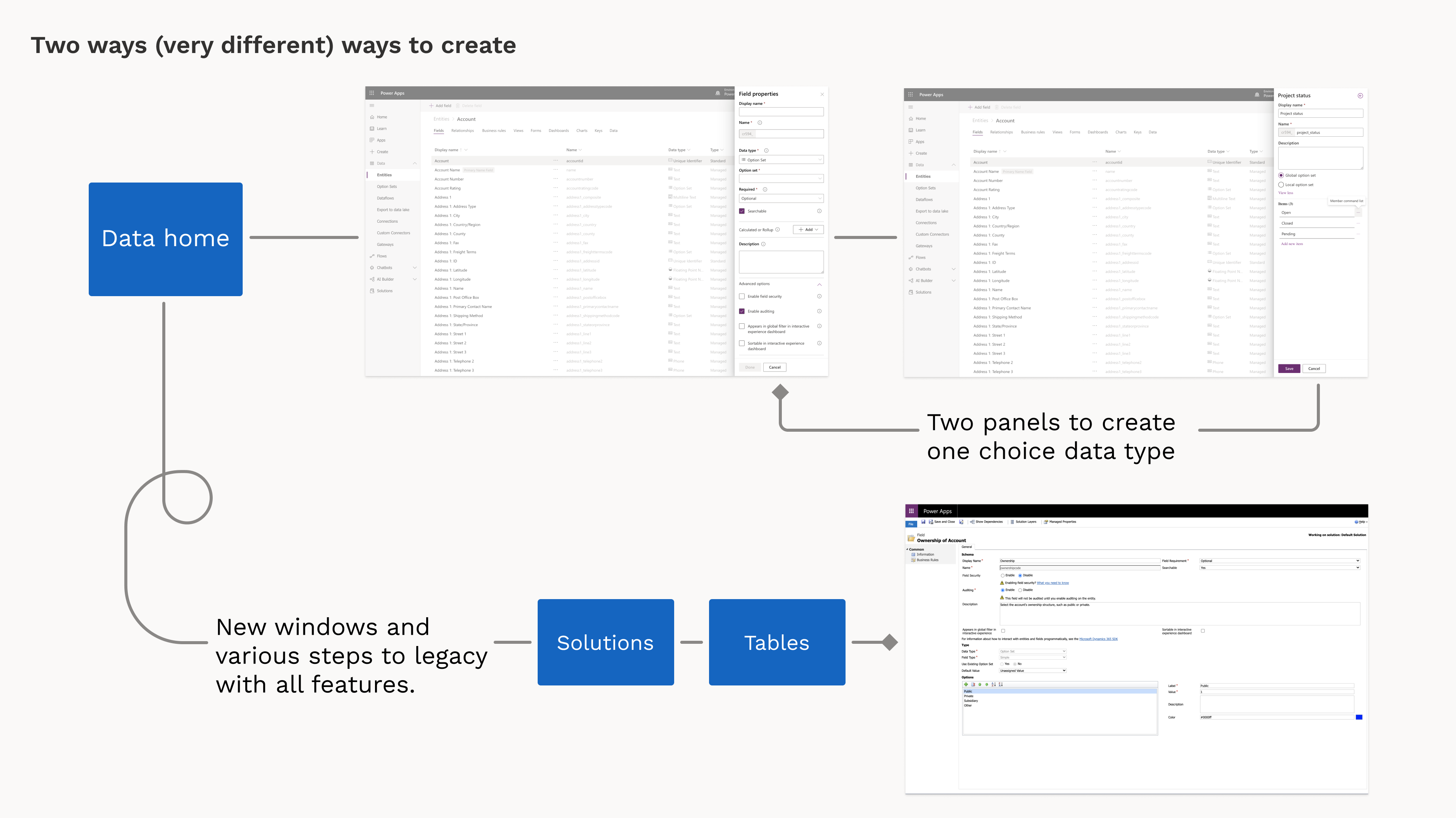

The separation of functionality between the updated product and legacy was pretty vast and forced some users to hop across multiple steps to complete their tasks. This part of the product was still seeing a 40% bounceback to legacy due to the lack of parity.
Process
Talking to users I learned that the push to the redesigned product space from the legacy experience was a concerning thing for longtime users. They often felt that for the sake of simplicity, full customization features were often omitted or overly simplified. They need the robust options of our product.
They were also frustrated by the amount of conflicting terminology and interaction patterns used to accomplish similar tasks which damaged their trust in product direction.
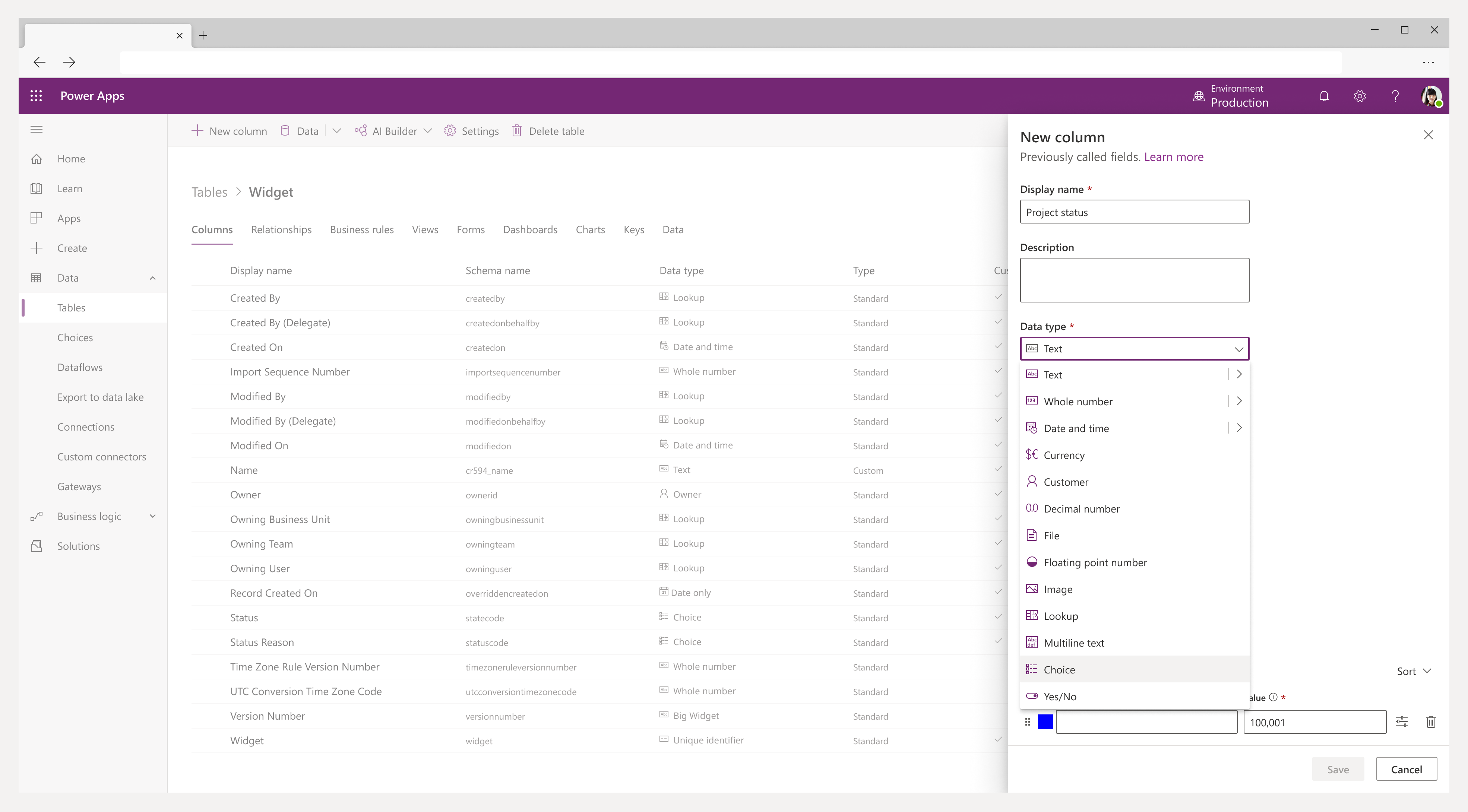
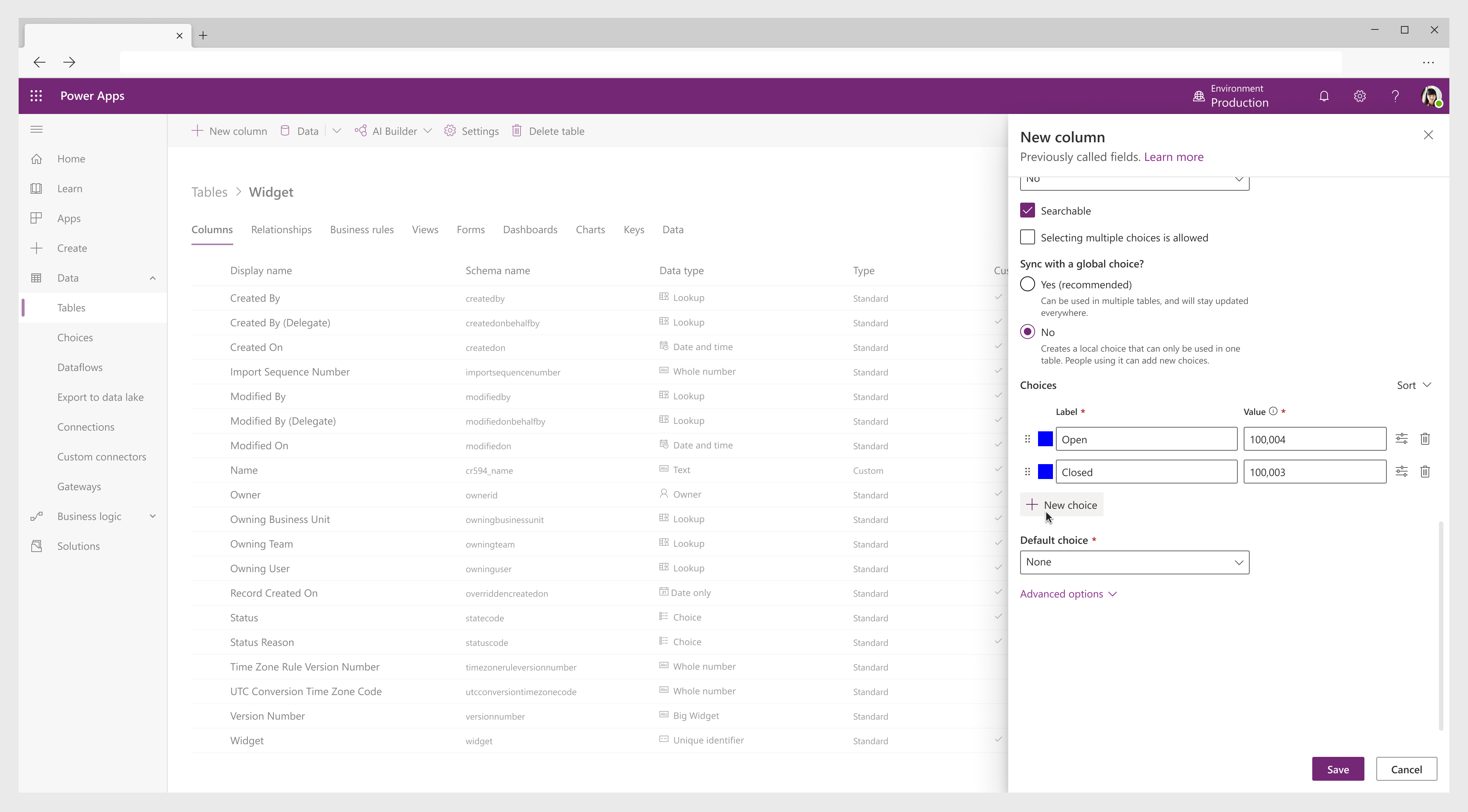
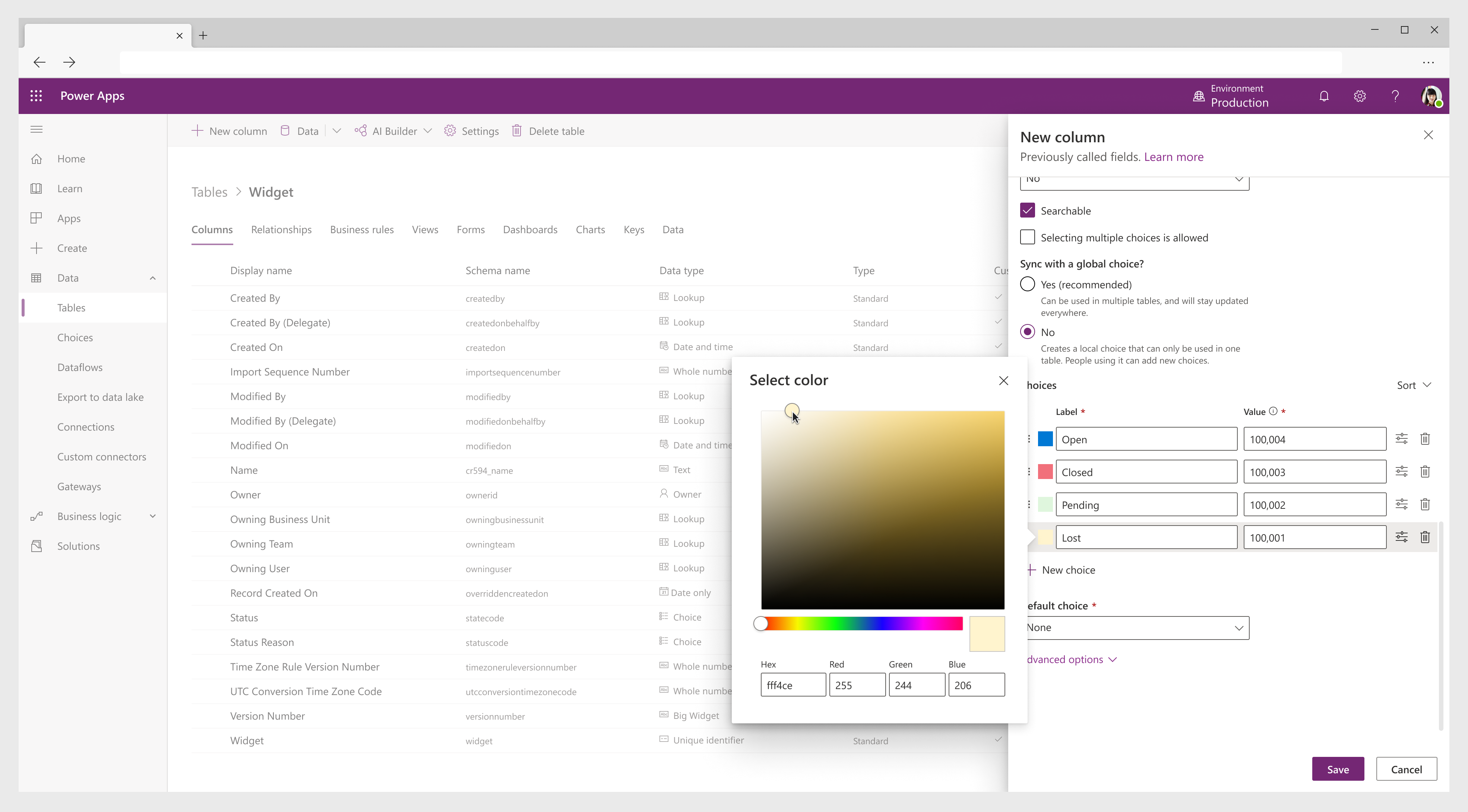
During the redesign process, I created a prototype and defined research questions to validate if users were able to create a new choice, understand specific complexities around local or global choice types, and change the color of choices. Overall users had over a 93% success rate creating a new choice, but they did have a hard time making it multiselect and syncing it with a global choice. I iterated on these pain points given the feedback.
Solution
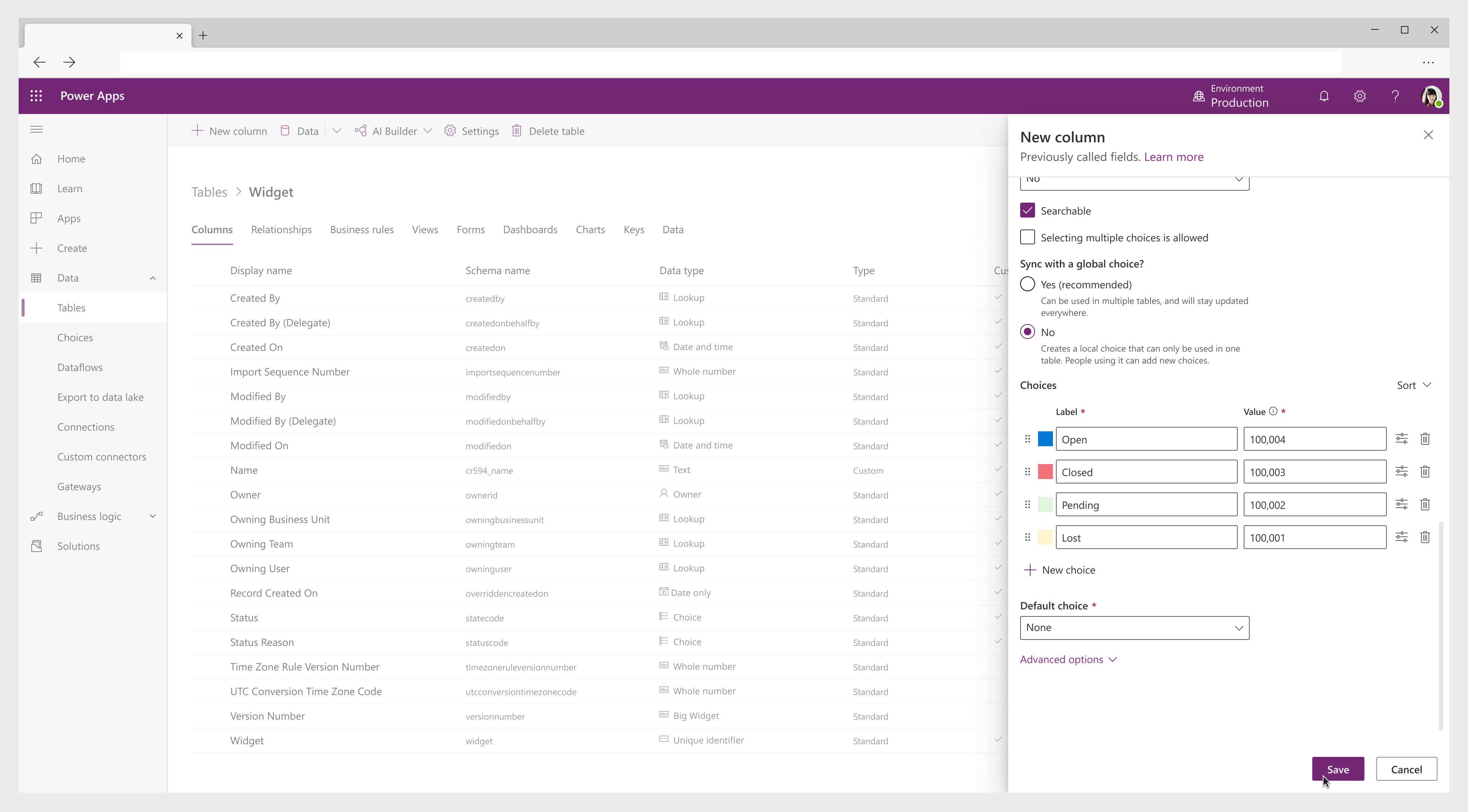
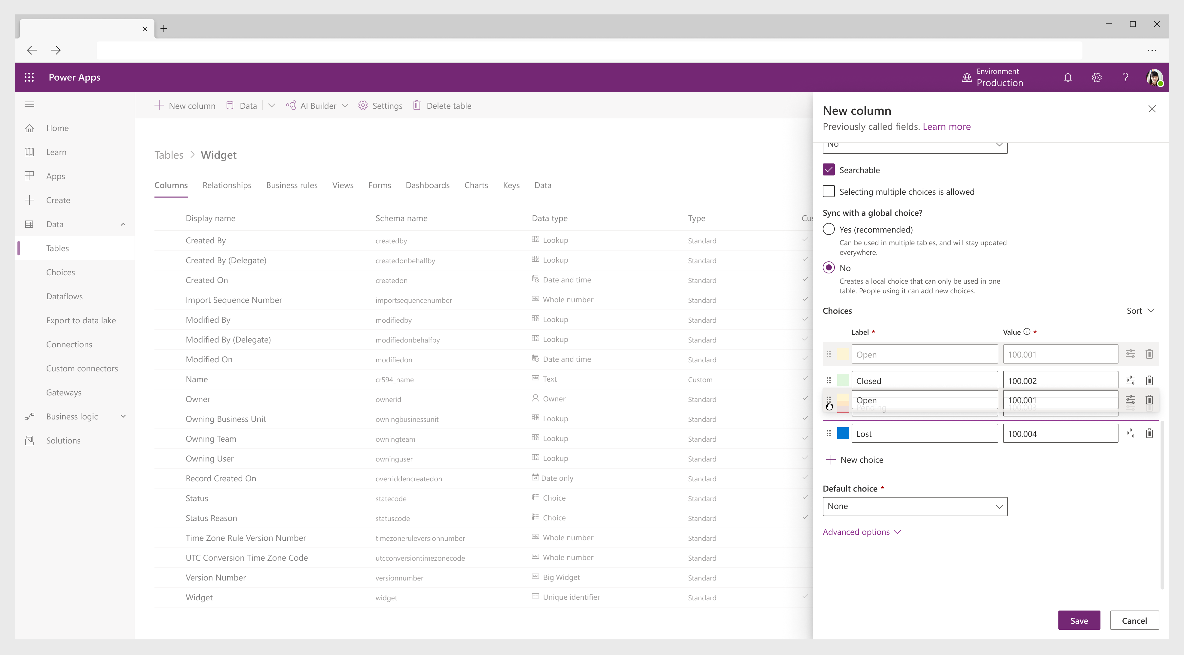
To reduce steps, I brought core creation and editing into a single larger panel. Full functionality and parity was brought in to reach expectations and needs of our longtime users who have been hesitant to move away from the legacy. Interactions and terminology were updated for consistency with the overall product.




Impact + takeways
"It definitely simplifies our lives of switching back and forth between the new editor and the classic editor 
Feedback from users was glowing and we saw a reduction in users returning to legacy which was a KPI for this feature. In addition, the release of this feature led to increased trust from long time users that we were listening to their needs as we continued to update and expand the product. Being able to change choice color was appreciated, but we did receive feedback that discoverability was an issue which will need to be resolved.
Working on this project taught me that “simplicity is best” shouldn’t mean reducing functionality. Choices had been simplified before and long time users weren’t able to do the job they needed anymore. Clarity of this complex task was ultimately more helpful here than stripping the feature down.

